
Why it matters
Project data becomes useful when it is organized around decisions, validated at the source, connected to ownership, and presented as evidence that helps responsible professionals act.
Section 1
From fragmented project information to decisions
AEC projects rarely suffer from a lack of data.
They suffer from data that is fragmented, inconsistent, difficult to compare and disconnected from the decisions people actually need to make.
Models contain parameters. Coordination platforms contain issues. Schedules contain milestones. Cost systems contain forecasts. Documents contain approvals and changes. Yet project teams often review these sources separately, export them manually and assemble reports after the moment for intervention has already passed.
The real challenge is not collecting more information. It is structuring project data so that it becomes understandable, trustworthy and useful for decision-making.
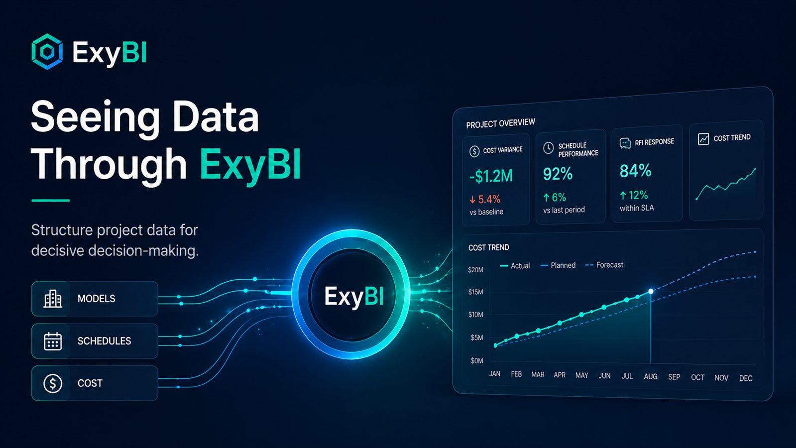
This is the perspective behind ExyBI.
ExyBI acts as a lens between raw project information and the people responsible for acting on it. It helps teams move from isolated model values to structured datasets, and from structured datasets to visible patterns, priorities and decisions.
Section 2
Data is not valuable simply because it exists
A model may contain thousands of parameters and millions of values, but volume does not automatically create insight.
Before project data can support a decision, teams must understand what each value represents, whether it is complete, which model or discipline owns it, when it was updated, and what action should follow when an agreed threshold is exceeded.
Without that structure, dashboards become decoration. They may look impressive while still forcing project managers and BIM coordinators to investigate every problem manually.
- What does each value represent?
- Is it complete and consistently formatted?
- Which model, discipline or package owns it?
- When was it last updated?
- Can it be compared with previous versions?
- Who is responsible for correcting it?
- What action follows when a threshold is exceeded?
Section 3
ExyBI provides a structured view of project information
ExyBI connects Revit and BIM data with Power BI workflows so project information can be reviewed at a wider and more useful level.
Instead of seeing only individual elements inside one model, teams can examine patterns across models, disciplines, parameters, classifications, versions, project packages, quality-control results and responsible parties.
The purpose is not merely to reproduce Revit schedules in another interface. The purpose is to reveal relationships that are difficult to identify while working inside individual authoring models.
A single missing classification value may look insignificant. When the same value is missing across 30 percent of one discipline’s elements, it becomes a delivery risk.
A handful of parameter errors may appear manageable. When those errors consistently increase between model versions, they reveal a process problem rather than an isolated modeling mistake.
ExyBI makes those patterns visible.
Section 4
Structure must come before visualization
A reliable dashboard starts long before the first chart is created. The data must first be organized around clear project questions.
A practical data-management workflow begins by defining the decision, selecting only the information required to support it, standardizing names and formats, validating the source and publishing a controlled dataset.
When the decision is unclear, the dashboard usually becomes a collection of unrelated numbers.
- Define the project decision first.
- Select only information that supports that decision.
- Standardize names, categories, dates and status values.
- Validate completeness, classifications and identifiers.
- Publish a controlled and repeatable dataset.
- Assign ownership and refresh responsibilities.
Section 5
Seeing data through the lens of ExyBI
A useful ExyBI dashboard should help users answer five questions: what happened, where it happened, why it happened, what it affects and what should happen next.
The first layer shows the current condition. The second locates the problem by model, discipline, zone, package or responsible organization. The third reveals the underlying pattern. The fourth connects the technical problem to its project consequence. The final layer supports a clear action.
A chart that cannot influence an action is not decision support. It is only presentation.
- What happened?
- Where did it happen?
- Why did it happen?
- What does it affect?
- What should happen next?
Section 6
From reporting to decision intelligence
Traditional BIM reporting often focuses on documenting what has already happened. A stronger ExyBI workflow supports earlier intervention.
Instead of reporting only the number of errors, teams can track whether the error rate is increasing, whether the same errors return after correction, which models generate repeated problems, how long issues remain unresolved and whether data quality improves between versions.
This changes the management question from “How many issues do we have?” to “Which recurring issues are most likely to affect the next delivery, and where should we intervene first?”
That is the difference between reporting and decision intelligence.
Section 7
Indicators that support real decisions
A useful ExyBI implementation may combine model-quality, coordination, delivery and management indicators.
The objective is not to place every available indicator on one screen. It is to create a sequence of views that moves from overview to diagnosis and then to action.
- Required-parameter completion
- Classification compliance
- Duplicate or invalid identifiers
- Open issues by severity
- Issue aging and closure rate
- Recurring issue categories
- Model-version age
- Package readiness
- Submission status
- Information-requirement compliance
- Performance against agreed thresholds
- Risk concentration and priority packages
Section 8
Data governance makes the dashboard sustainable
A dashboard is not a one-time deliverable. It is part of a data-management process.
Each important indicator should have a documented definition, an identified source, an assigned owner, a refresh frequency, a validation rule, an agreed threshold and a required response.
For example, parameter completeness must define which parameters are mandatory, which elements are included, how not-applicable values are treated, when the metric is calculated, what percentage is acceptable and who acts when the value falls below the threshold.
Without those definitions, different users interpret the same metric differently and trust in the dashboard declines.
Section 9
ExyBI does not replace engineering judgment
ExyBI does not decide whether a design is correct. It does not replace BIM coordination, engineering review or project leadership.
Its value is that it gives those roles a clearer and more structured view of the available evidence.
It helps teams identify where attention is required, which patterns deserve investigation, which risks are increasing, which actions are overdue and where project information cannot yet be trusted.
The decision remains with the responsible professional. The data simply becomes more usable.
Section 10
From isolated data to decisive action
The strongest project teams do not merely collect information. They organize it around decisions.
They establish consistent definitions, validate the source, track changes and connect technical indicators to project consequences.
ExyBI supports this transition by giving BIM and AEC teams a structured lens through which model data can be understood at project level.
The result is not just another dashboard. It is a more disciplined way of seeing project information, identifying what matters and acting before small data problems become major delivery problems.
Practical takeaways
- More project data does not automatically create better decisions.
- Data must be structured around clear project questions.
- Visualization should follow normalization and validation.
- ExyBI exposes trends across models, versions, disciplines and delivery packages.
- Effective dashboards connect technical indicators to ownership and action.
- Data governance keeps reporting reliable over time.
- ExyBI supports professional judgment rather than replacing it.
Reality check
- A dashboard cannot repair inconsistent source data.
- Automation cannot compensate for undefined information requirements.
- Indicators without owners rarely lead to action.
- A visually polished report can still be operationally useless.
- Reliable decisions require both trustworthy data and responsible people.
Related commands and features
Power BI-ready datasets, Model-quality indicators, Version trends, Data-governance views, Decision dashboards
See your project data differently
Explore how ExyBI can help structure Revit and BIM information for clearer project reporting and more decisive decision-making.
Explore ExyBI